When usability goes wrong (or just isn't used at all)
Pictures I've taken which illustrate the need for understanding the people who will use your thing.
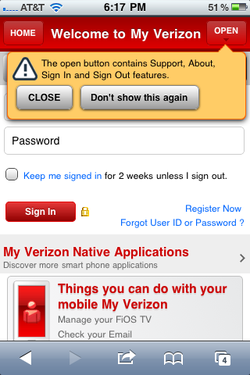
'Open' is such a general term...Did they just run out of space on the design? Issue: The label is just soooo generic and gives you no clue what options are available if you choose that button. Heck, it's an action verb so you don't really even get a sense that there are options there! You really expect it to do an action, not provide options. The term is so generic that the designers actually had to put in a popup that explains the functionality. I'd argue if you labeled the button appropriately (or perhaps split some of the options out or provide some sort of overarching navigation) you wouldn't need this popup as it would be intuitive to figure out what options were available. I'm dying to know the research that led four major options to be put under this one label. |
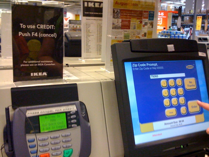
How bad do you want that Ektorp?Turns out, if you want to use your credit card at IKEA's self check out, it's harder than you think.
Issue: You have to really work at it to use a credit cared (got a debit card? then just swipe and pay). You have to hunt for the word 'Cancel' (which doesn't exist on the PIN pad interface--it just says 'No') to start the credit process. Once that fails, then you have to notice the sign above the PIN pad (when is the last time you looked that high at a check out?) and then search for the F4 button (is it on the PIN pad? On the UI to the right?). I think I'll just bring cash next time. ;) |
It's 10:30pm, is your AC working?Picture it: North Texas, 102 degrees outside at 10:30pm. Your AC has stopped blowing cold air and you find this error message on your thermostat. What do you do? Issue: The system says there is an alert, gives you the color of yellow for the triangle and provides an error code but that is where the information provided by the interface ends. There are only two actions: 'close' and 'contact dealer', neither of which will immediately solve the issue. The thermostat can tell you the weather, report on your energy usage for the past month/year but it can't tell you what is wrong with the AC unit except for the innocuous error code. I wouldn't expect the thermostat to walk you through how to fix the issue, but at least it could give a bit more away about what caused the problem. Perhaps an icon, a short explanatory statement, etc. Looks like it's going to be a hot night in the city tonight. |
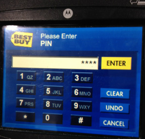
How bad do you really want that new tech gadget?On a recent trip to Best Buy, I was presented with this PIN pad interface. Can you spot the barrier to conversion? Let me give you a hint: it's yellow. If you put the 'Enter' button next to the field where your PIN displayed, I can almost guarantee it will be overlooked each time. Why? You aren't entering the data in the field, like you do with a web form. Instead, you are using the number pad below it. So your attention is focused on the number pad below the field. And where do you go to click those 'continue' buttons on websites and other applications? The lower right hand corner. And what's there in this case? The 'cancel' button. I had to enter my number three times on this trip. If they had only moved the yellow 'Enter' button to the lower right corner, this wouldn't be an issue. |


